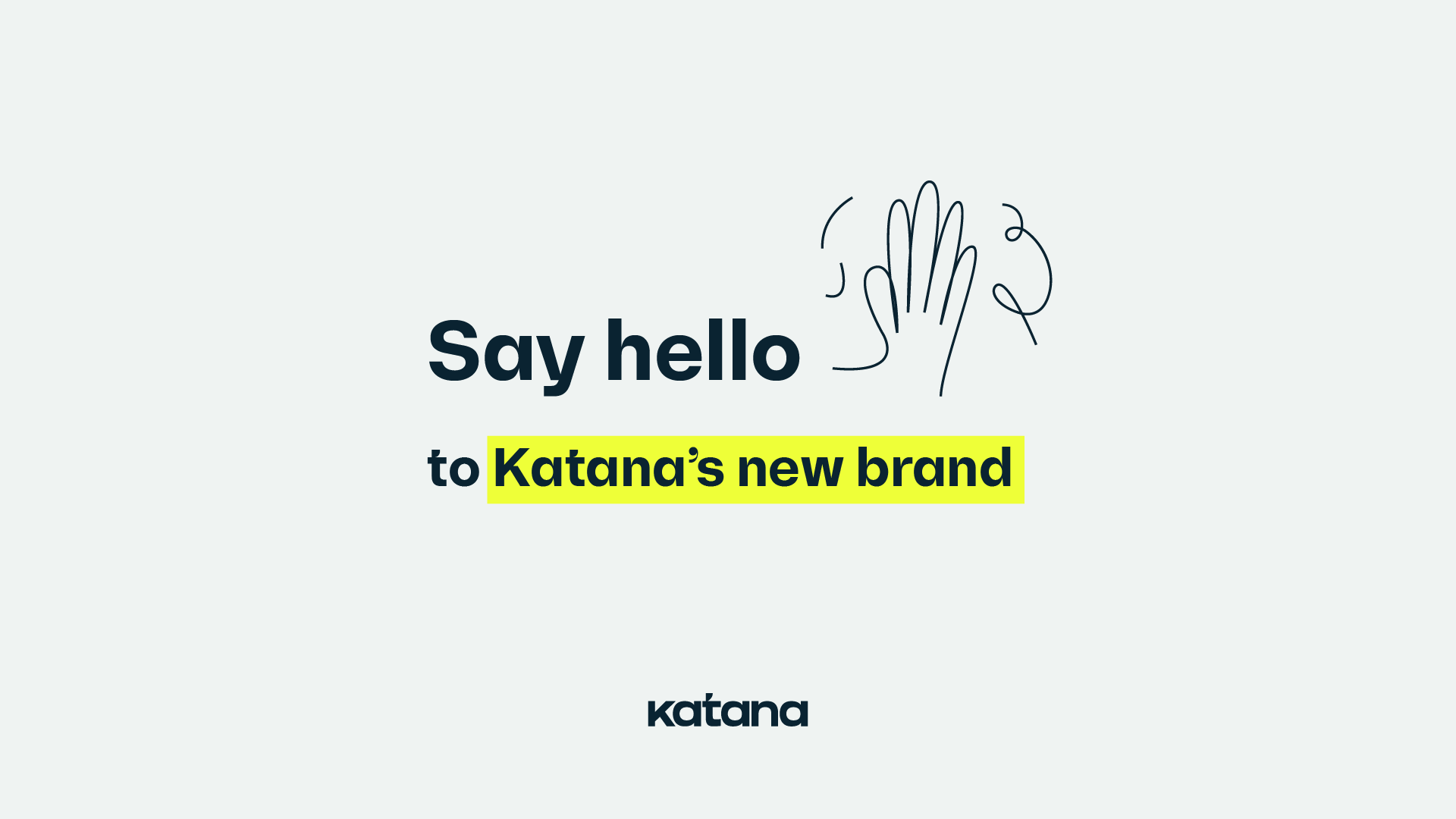
Introducing Katana’s new brand and the story behind it
There is a lot more to a brand than what meets the eye, and we wanted to share the story behind our new look and why we decided to make the change.

First, the story behind the brand
A brand is much more than a logo or color palette — it is how people experience Katana as a company and product. It is the sum of all our brand elements, features, and people, expressing who we are as well as what we strive for.
Behind every great brand is a clear vision and mission. At Katana, our vision is a world where manufacturers love the software they use as much as the products they make. We work towards this world by giving manufacturers the live insights they need in a world where change is the only constant.
These statements are rooted in our founding team’s belief that manufacturing software should be intuitive and inspiring and that any manufacturer should be able to get a live look at their business.
Why it was time for a new look
This year we saw Katana evolve rapidly — within and without.
Our customer base is rapidly expanding to include small and medium-sized businesses, and our team grew to over 50 Katanauts across Europe and North America. By the end of the year, we expect to see even more great people join our team and more manufacturers with millions of revenue included in our customer portfolio.
While growth comes with many benefits, it also comes with challenges. Maintaining a strong identity as a large team is vital to keep our company culture alive. And as we expand to new markets and customer segments, we need a brand that defines who we are in a distinct and recognizable way.
We want the world, ourselves included, to understand what we do, why we do it, and how to spread that message clearly and consistently.
How our new logo tells our story
Japan is the birthplace of lean manufacturing. The earliest lean production principles come from the Toyota Production System (TPS), a philosophy developed in the 1930s. These principles stood the test of time and have redefined how modern manufacturers build products.
The name Katana is an homage to these roots, and our new logo and logomarks bring more of that story to light. The accent on the “t” represents the tip of a katana blade. And the yellow circle behind our logo mark is a tribute to the circle of the sun element of the Japanese flag.
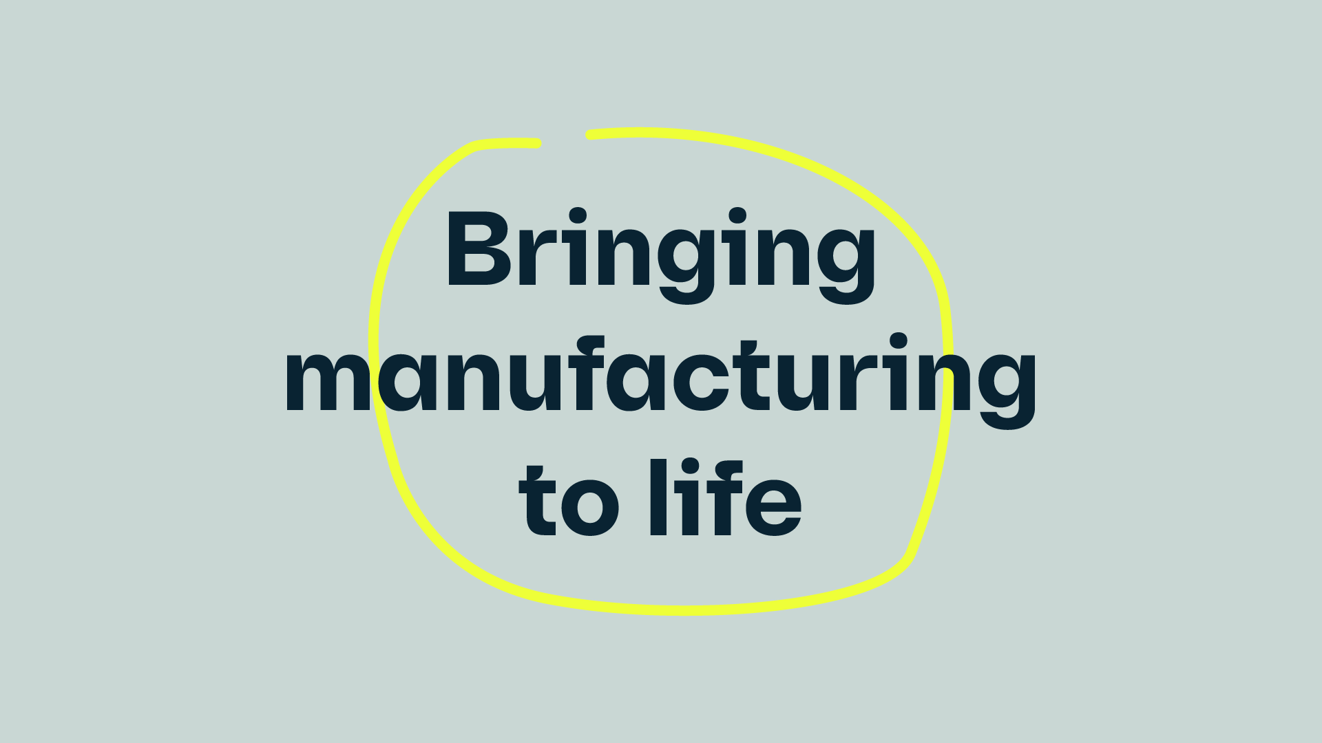
Bringing manufacturing to life
Manufacturers bring ideas to life, combining raw materials to create products greater than the sum of their parts. And what sets Katana’s software apart is the use of color and design to give manufacturers a live look at their business in motion.
Our tagline, bringing manufacturing to life, sums up the value of our product and how manufacturers inspired us to build it.
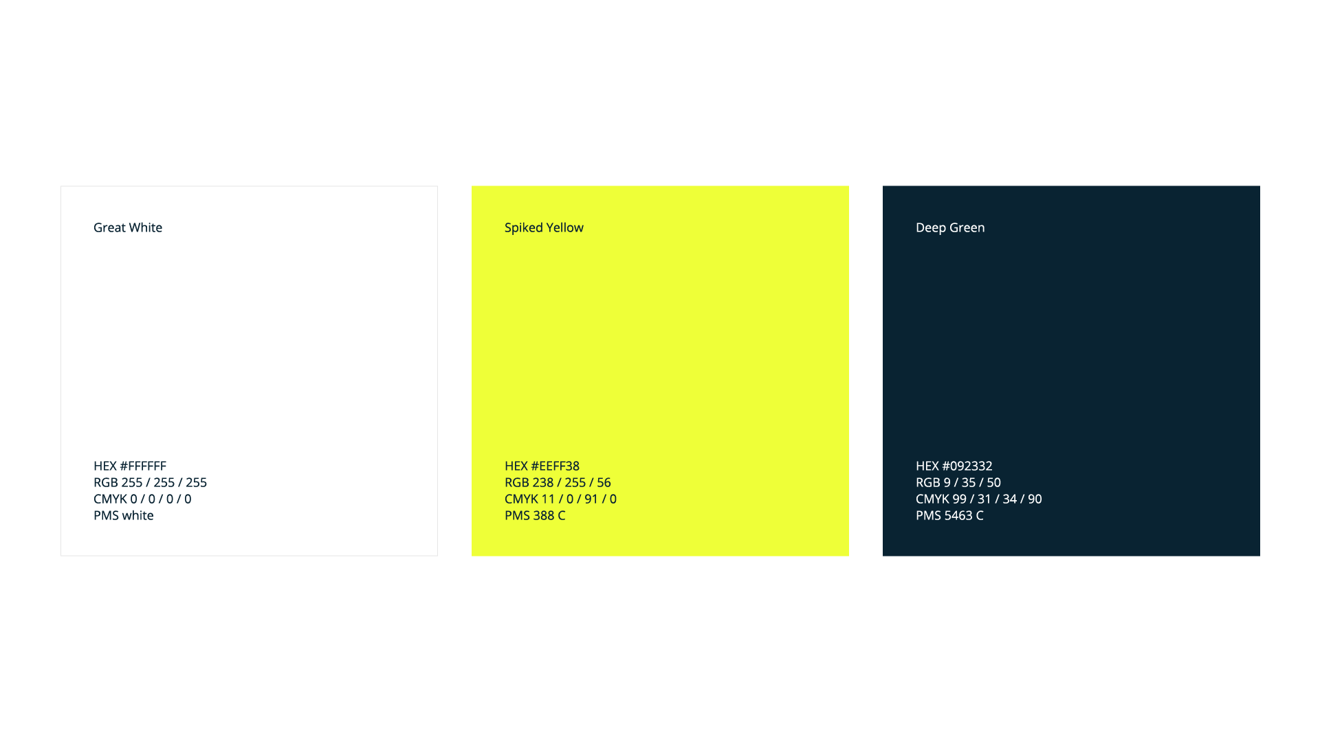
Creating great products and software is exciting and inspiring, and our color palette should match that energy. Green and yellow are the colors of life, and bright yellows are also frequently used in manufacturing. Our primary color palette balances a fresh, vibrant yellow with a grounding green to bring vitality to our visual brand.
Our secondary color palette adds a human touch and softens our primary colors when used together. They give Katana a vivid and friendly feel.
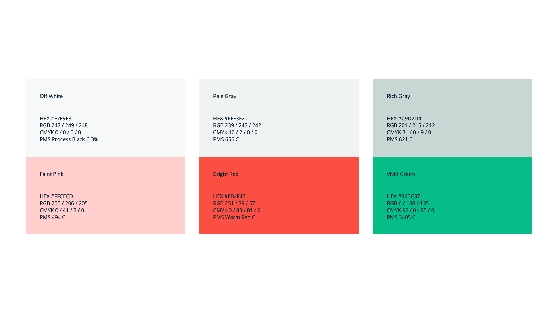
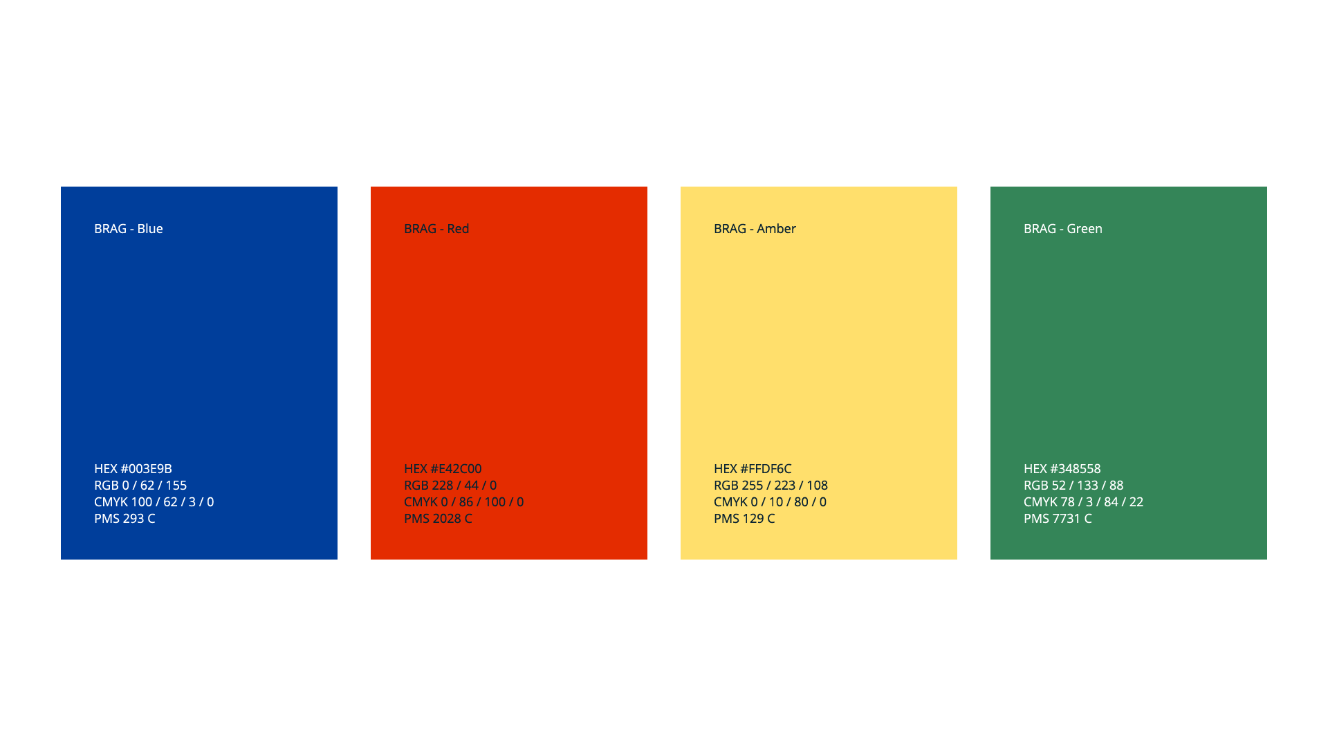
Throughout Katana’s product, we visualize statuses with revitalized red-amber-green (RAG) colors with an extra blue for common interactions. Together, they are our humble BRAG colors.
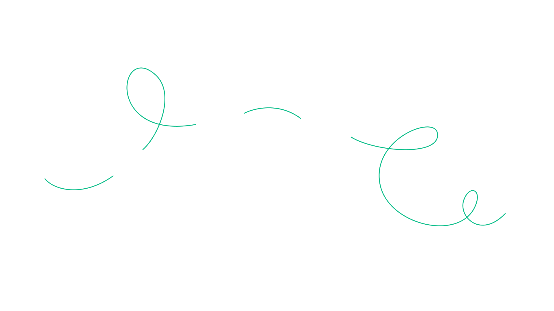
Meet the Whee!
The Whee! is all about continuity and movement. It is a playful way to visualize the dynamic, live nature of Katana and is inspired by the movement of a katana blade. In graphics, we use the Whee! to illustrate ideas and content statically. In animations, we use Whee! to guide the eye between actions.
Modern brands are bold, accessible, and human
To ensure that anyone can experience Katana, all the color combinations we use match WCAG web content accessibility guidelines.
We also consider accessibility when writing copy. Our communication style is knowledgeable yet straightforward, while our tone of voice is friendly and enthusiastic. There are passionate humans behind our software, and the way we write reflects that.

Photo language is also a critical brand element, and a natural style characterizes the images we use. We try to capture situations from everyday life, featuring our team and customers in their authentic surroundings where they feel their best.
Staying true to ourselves as we evolve
Over the years, we evolved alongside the very first believers in our vision — micro manufacturers. Their love for our product shaped Katana into what it is today, and our new brand gives that same vision the boldness we need to take on the challenges that come in this exciting new growth stage.
In the words of our Co-founder and CEO, Kristjan:
“We will always have a soft spot for small manufacturers, and enabling entrepreneurship for thousands of Katana customers is something our team is very proud of. But businesses with millions in revenue also need to be served.”
And our new look instills trust and builds recognition without losing the elements that make Katana, Katana.
Get inventory trends, news, and tips every month
Explore all categories
Get visibility over your sales and stock
Wave goodbye to uncertainty with Katana Cloud Inventory — AI-powered for total inventory control
